Beach Party
A feature rich slot game designed to maximize player engagement and visual appeal.


Beach Party: The Problem
-
Most slot games are designed for a single platform, causing layout and usability issues across devices. Beach Party needed to deliver a seamless, responsive experience on PC, tablet, and mobile while maintaining its bright summer theme.
-
The limited schedule and small team required me to independently handle most UI/UX design tasks, from responsive layout design to user testing.

Process
User Research and Synthesis, Ideation, Prototyping, Usability Test
Tool Used
Figma, Photoshop, Jira
Number of Team
2 people
Duration
6 Weeks
My Role
UI/UX Designer
Solutions
To ensure a consistent experience across devices, our design team created separate layouts for PC, mobile landscape, and portrait modes. I established a responsive UI framework that allowed key elements to scale and reposition smoothly across screen sizes.
By closely aligning with the frontend and project management teams, I prioritized essential UI assets, reduced rework, and maintained production efficiency under the tight schedule.
Design Process
Research
Synthesis
Ideation
Low-Fi Design
High-Fi Design
Reflection
Trending
01 Research
Designing for Delight: Learning from Real Players
-
At the start of the project, we conducted research to understand player expectations and market trends in slot games. We analyzed and played a variety of popular titles across PC and mobile platforms to study their design patterns, pacing, and reward systems.
-
In addition, we conducted interviews with active slot players to learn what makes gameplay engaging, what frustrates them, and how device differences affect their overall experience.
01
Preferred Devices
02
Gameplay Motivation
03
Visual and Theme Preference
04
Pain points On Different Device
05
Desired Features
Competitive Analysis
Conducting a competitive analysis was essential for understanding both player preferences and market expectations. Through this process, we were able to:
-
Identify Opportunities: We pinpointed features and visual strategies that resonated strongly with players, while also identifying areas in our own product that required improvement.
-
Align with User Expectations: By studying top-performing games, we gained insights into effective UX patterns and feature sets that players have come to expect.
-
Differentiate Our Game: The analysis also revealed common visual and gameplay trends, helping us define a distinct style and user experience that would stand out in a competitive market.

Juict Fruit

God's Gambit Poseidon

Space Quest: Moon
Juict Fruit
God's Gambit Poseidon
Space Quest: Moon
Multi-platform support
✔
✔
✔
Responsive layout (portrait + landscape)
X
X
X
Visual consistency
X
✔
✔
UI clarity on mobile
✔
X
X
Seasonal theme engagement
✔
X
X
Through the competitive analysis, I discovered that while many slot games offer strong visuals and engaging gameplay, most lack responsive layouts that adapt well across devices. This limitation often leads to inconsistent user experiences between PC and mobile.
These findings highlighted an opportunity for Beach Party to stand out by delivering a truly adaptive interface — ensuring smooth interaction, visual consistency, and usability on every platform.
Trending
02 Synthesis
Balancing excitement and What Players Value Most
From my research, four key themes emerged around how players engage with slot games and what affects their enjoyment.
Players treat slot games as light entertainment — a quick, stress-free escape
Bright, seasonal visuals enhance emotional engagement and make play more enjoyable.
Same layouts design but different platform will disrupt flow and reduce immersion.
Players want a consistent, responsive experience that feels natural on any device.
01
Need for Relaxation
02
Love for Vibrant Themes
03
Frustration with Inconsistency
04
Desire for Seamless Play

.png)
My research led me to wonder…
How might we create a slot game experience that feels consistently fun and intuitive across all devices — capturing the joy of summer without sacrificing usability?
Trending
03 Ideation
Finding the Balance Between Fun and Function
I explored multiple layout systems and interaction flows to discover how the summer-themed slot game could feel equally enjoyable on PC and mobile.
Ideation
By exploring different play patterns and interface layouts, I brainstormed multiple ways to make the game experience both fun and consistent across devices.
Some early directions included:
-
Designing adaptive UI layouts that automatically rearrange key buttons based on screen size and orientation.
-
Using color and motion cues to guide attention without clutter.
-
Creating a summer-themed reward flow, where users collect shells, coins, or suns to unlock animations.
-
Developing a touch-friendly interface optimized for thumb zones on mobile.
-
Implementing auto-scaling assets to maintain clarity across resolutions.
Early Ideas
1. Split-Layout System
A dynamic UI grid that reorganizes itself between PC and mobile, ensuring important elements (spin, bet, and rewards) remain in ergonomic zones.
2. Seasonal Visual Feedback
Introduce subtle summer animations — waves, sunlight, and beach icons — as visual cues for wins or bonuses, enhancing emotional engagement.
Selected Idea — Responsive Beach Interface
The most effective concept was the Responsive Beach Interface, which ensures visual and interaction consistency across devices while maintaining the tropical, lively feel of the theme.
The design leverages a component-based system that adapts element spacing, scaling, and animation timing for PC, tablet, and mobile screens — allowing players to enjoy the same sense of relaxation and excitement no matter where they play.
I created a modular UI system where components automatically scale and reposition based on device resolution and orientation. This system simplified collaboration with developers and ensured consistent usability on both PC and mobile.
Effortless Adaptation: Building a Responsive Component System
Trending
04&05 Design
Designing a Responsive, Beach-Themed Experience
The interface design focused on balancing visual excitement with cross-platform clarity.
The goal was to maintain the vibrant, summer-inspired atmosphere while ensuring all key actions — spinning, betting, and collecting rewards — remained accessible and readable on every screen size.
Low-Fidelity


Moodboard: Learning from Existing Beach-Themed Slot Games
To define the visual direction, I collected references from existing slot games featuring summer and tropical themes.
These examples helped me analyze how color, composition, and motion contribute to the overall atmosphere.
While many games used realistic textures and saturated lighting, I aimed to create a softer, more playful visual tone — balancing the vibrancy of summer with a clean, modern interface suitable for both PC and mobile.


Hi-Fidelity

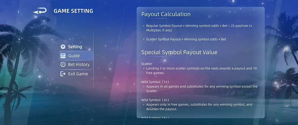
Main Interface

Setting

Mobile

Main Interface

Setting

Bet History

Bill Detail
Trending
Users responded positively, but there was room to refine the experience.
I conducted usability testing sessions with 6 participants who frequently play casual slot games on mobile and PC. Overall, players enjoyed the game’s bright visuals and summer atmosphere, describing it as “fun,” “relaxing,” and “visually appealing.”
However, feedback revealed several opportunities for improvement:
-
Players expected a more luxurious visual tone to match the feeling of winning and high-value rewards. The current summer theme felt cheerful but slightly too casual.
-
The visual style between the main menu and in-game interface lacked consistency, which made transitions feel less polished.
-
Buttons were not visually prominent enough, especially on smaller screens, causing hesitation before tapping key actions like “Spin” or “Bet.”
Iteration
These findings informed the next design iteration, where I refined the visual hierarchy, unified the color and lighting direction, and enhanced button contrast and animations to create a more premium yet approachable slot experience.
During the revision phase, several players suggested adding new features to make the gameplay more engaging. After analyzing their feedback, our team agreed that these ideas could enhance both player motivation and replay ability.
As a result, we introduced two additional features:
Buy Free Game – allowing players to spend money to instantly access the Free Game mode.
Double Chance Feature – giving players the option to double their chance of triggering the Free Game.
These additions brought more excitement and agency to the gameplay, giving users greater control over their playstyle and risk-reward balance.
Final Design

06 Reflection
Outcome
-
The game is not yet release. Please stay tune
The Experiences
This was my first time working on a game project with a large cross-functional team, and it was an incredibly valuable learning experience.
I gained a deeper understanding of how to collaborate effectively with different departments including art, programming, and production and how to communicate design decisions clearly across disciplines.
I also improved my ability to present design work in a way that is both visually clear and easy for non-design teammates to interpret and implement.
Insight & Illustrations Improvement
Throughout this project, I significantly improved both my UI design skills and proficiency in Figma.
I learned how to clearly communicate design ideas and solutions in a more professional and structured manner. Additionally, I optimized my Figma workflow — leveraging components, auto layout, and prototyping — to work more efficiently and deliver high-quality results faster.
If I had more time
If given more time, I would further improve the structure and organization of my Figma files to make them more accessible for developers and other team members.
While the designs were functional, I realized that better documentation, clearer naming conventions, and a more systematic component setup would streamline handoff and make collaboration even smoother.