

Tavern Tressure UI&UX Design
An engaging, content-rich slot game crafted to deliver excitement with every spin. My role focused on shaping the user experience and designing secondary UI elements like menus, pop-ups, and the structure.
1. Project Overview
The Concept

Tavern Tressure: The Need & Challenge
-
This was our company's first slot machine project, intended to set the foundation for future titles. Given the tight timeline, we were challenged to deliver a polished and feature-complete product in a short development cycle.
-
The game needed to support three different platforms — PC, mobile (landscape), and mobile (portrait). As the UX designer, I was responsible for creating responsive secondary interfaces for all three versions, ensuring consistency and usability across devices.
-
Our target audience was primarily East Asian players, which required additional research into their preferences, visual aesthetics, and what elements drive excitement and engagement in slot gameplay.
Solutions
-
To better understand our target audience, we conducted user interviews and market research focused on East Asian player preferences.
-
We also performed a competitive analysis of similar slot games to identify industry best practices and uncover common UX/UI pitfalls. This helped us refine our design direction and avoid repeated mistakes seen in competitor products.
Design Process
Empathize
User Interviews
User Research
Competitive analysis
Define
Persona
Empathy Mapping
Ideate
User Flows
Task Flows
Design
Low Fidelity
High Fidelity
Test
Usability test
Feedback
2. Empathize
Research & Interview
Understanding the User's Need
At the beginning of the project, we conducted research to understand what visual elements Southeast Asian players find most appealing in slot games. Our goal was to define a clear art direction that resonates with our target audience.
-
Through user interviews and secondary research, we found that players strongly prefer bright, high-contrast visuals. Vibrant color palettes — especially gold and red — are associated with good fortune and positive outcomes.
-
Additionally, players are highly drawn to exaggerated win animations and rich visual effects. These elements enhance the feeling of being a "big winner" or millionaire, which is a key part of the emotional payoff they seek in slot games.
Competitive Analysis
Conducting a competitive analysis allowed us to better understand both market trends and user expectations. This research helped us in three key areas:
-
Identify Opportunities – We pinpointed features and visual elements that resonate strongly with players, while also recognizing areas where our current design fell short.
-
Align with User Expectations – By studying UX patterns and core features across top-performing slot games, we gained insights into what users are accustomed to and what they value.
-
Differentiate the Product – Understanding what’s trending in the market helped us position our game more strategically, identifying ways to create standout features and a unique visual identity.


Juicy Fruits
Art Style Analysis – Slot Game
Core Theme:
Realistic Fruits with a Polished, Saturated Finish
-
High saturation, realistic rendering mixed with metallic textures
-
Targeted at adult casual to mid/heavy players who appreciate refined visuals
Game Element Design
-
Fruit Icons:
Highly detailed with realistic textures (skin, gloss, pulp), enhanced by highlights and shadows to create a juicy, semi-3D look -
Non-Fruit Symbols:
-
Golden Bell: Strong metallic feel with red ribbon accents; acts as a visual anchor
-
Diamond Scatter: Large blue diamond with gold trim and bold “SCATTER” text; high visual impact
-
Typography:
Bold cartoon sans-serif with shadows — legible, playful, and vibrant
UI Colors:
Dominated by gold, orange, and red hues; overall rich and saturated fruit-inspired palette
Extra Juicy
Art Style Analysis – Minimalist Fruit Slot Machine
Core Theme:
Minimalist Fruit Elements with a Flat-Realistic Fusion
-
Combines anthropomorphic illustration with flat white styling
-
Features highly saturated fruit colors set against large, clean white backgrounds
Game Element Design
-
Fruit Icons:
Stylized with spherical highlights, soft shadows, and smooth gradients to convey roundness and gloss
Avoids detailed textures—emphasizes light and shadow over realism for a friendly, illustrated feel
Typography:
Bold cartoon-style sans-serif with shadows; fun, clear, and easy to read
UI Design:
-
Creamy white backgrounds enhance clarity and contrast
-
Subtle golden strokes suggest a high-value, jackpot feel
All Ways Candy
Art Style Analysis – Candy + Fruit Slot Machine
Core Theme:
Candy-Fruit Fusion with a Playful, Colorful Tone
-
Highly saturated candy-like colors (red, orange, purple, green, blue)
-
Sky blue background for a fresh, cheerful feel
-
Targeted at adult casual players seeking a lively, lighthearted experience
Game Element Design
-
Fruit Icons:
Bright and saturated with light shadows and reflective highlights
Texture resembles bubble stickers or soft candy—glossy and smooth -
Candy Icons:
Simple shapes (pentagon, triangle, heart) in solid colors
Mirror-like candy textures with prominent surface highlights
Typography:
Bold cartoon-style sans-serif with shadows — clear, fun, and slightly childish in tone
UI Design:
-
Dominant gold and orange tones on key buttons (MAX BET, BET, SPIN) to convey value
-
Buttons feature light anthropomorphism with 3D shadows and highlights
-
Left-side UI (BONUS BUY, BET) uses pink gradients and candy textures for visual hierarchy and emphasis
3. Design
Low & High Fidelity
Goals
-
Our primary goal was to create a seamless and intuitive user experience, ensuring players could effortlessly navigate the interface and access key features without friction.
-
Visually, we aimed to deliver a more luxurious and refined aesthetic to elevate the perceived value of the game. We wanted the art direction to feel fresh and distinctive, moving away from conventional slot game visuals.
-
Additionally, we placed strong emphasis on optimizing the design for mobile behavior patterns. The interface needed to feel natural and comfortable on both landscape and portrait mobile layouts.
Low Fidelity
-
Based on player interviews, gameplay observations, and analysis of user priorities, we identified a need to reduce on-screen information density in order to improve immersion.
-
Players were more engaged when the interface felt focused and uninterrupted, allowing them to lose themselves in the game without distraction.
-
To support this, we divided the UI into two primary layers: a first-level screen dedicated to core gameplay, and a secondary layer for system-related content such as settings and info panels.


Mood Board
-
Through a review of existing slot games on the market, we noticed that many adopted a cartoonish and playful art style, which lacked the sense of luxury we aimed to deliver.
-
After discussing our findings and recommendations with the project stakeholders, we aligned on a new direction inspired by the visual style of Hearthstone — a polished, fantasy-themed aesthetic with a cozy tavern atmosphere that better suited our target tone.
High Fidelity
PC

Main Interface

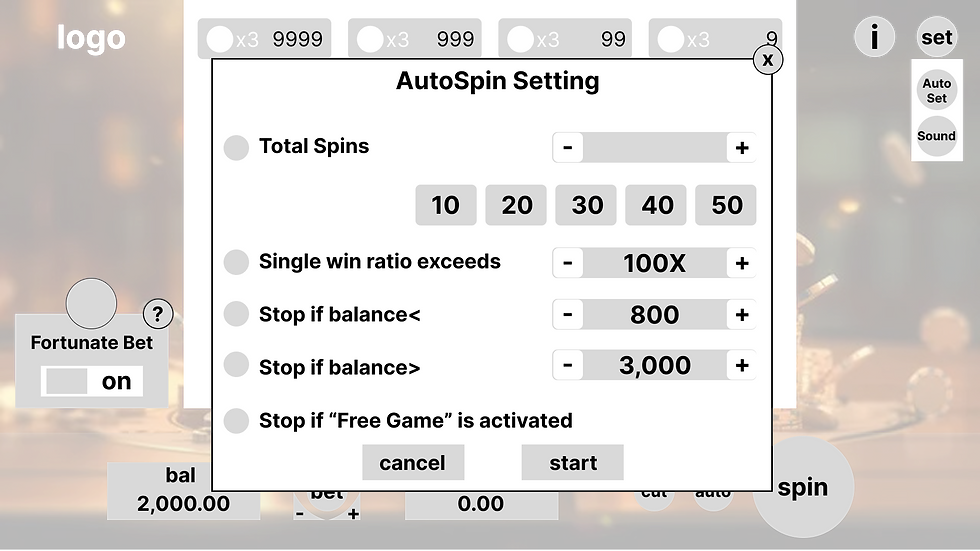
Setting

Bet History

Bill Detail
Mobile

Main Interface

Setting

Bet History

Bill Detail
4. Test Phase
The Iteration
Feedback
-
During user testing with players and internal stakeholders, we received valuable feedback regarding the bet history section. Users expressed a strong desire for a more information-rich layout that would allow them to view a larger number of past winning records at a glance.
-
Additionally, consistency in visual style was emphasized. The team preferred a lightweight and streamlined design approach for the table layout to align with the overall aesthetic of the game.
Iteration
-
After team discussions and additional user research, we discovered that players care less about detailed betting records and more about the outcome — whether they won or not. This led us to simplify the design by visually emphasizing the distinction between winning and non-winning results, rather than showing excessive detail.
-
We also identified a UX issue in how profit was being displayed. Showing exact profit/loss figures — especially losses — negatively impacted the player's emotions and overall game experience.
-
As a result, we replaced "Profit" with "Win" in key displays, and adjusted both the base game and free game interfaces to highlight “Winners” versus “Non-Winners,” avoiding language that implies losing.
Result


4. Test Phase
The Iteration
5. Reflection
Outcome & Improvement
Outcome
-
The game will be released at the end of August, so let's look forward to it.
The Experiences
This was my first experience collaborating with a large cross-functional team on a game project. Throughout the process, I not only deepened my understanding of UX/UI design principles but also developed essential communication and collaboration skills.
I learned how to effectively work alongside artists, programmers, and other stakeholders, ensuring smooth alignment across disciplines. Additionally, I improved my ability to present and articulate design decisions in a clear and visually accessible way for both technical and non-technical teammates.
Insight & Illustrations Improvement
Throughout this project, I significantly improved both my UI design skills and my proficiency with Figma.
I learned how to communicate design ideas and solutions more clearly and professionally, and developed faster, more efficient workflows using Figma’s advanced features such as components, auto layout, and interactive prototyping.
If I had more time
If given more time, I would further refine the presentation of my design files to enhance clarity and usability for cross-functional teammates.
While the designs were functional, I realized that improving documentation, organizing components more systematically, and streamlining the Figma structure would help other team members — especially developers — quickly understand and apply my work more efficiently.