BACKGROUND
fAIshion.ai offered an AI-powered Chrome extension that allowed shoppers to virtually try on clothing and receive size recommendations while browsing fashion websites.
However, the existing website presented several product capabilities at once without clearly explaining the core try-on experience, how the extension worked, or what users needed to do to get started.
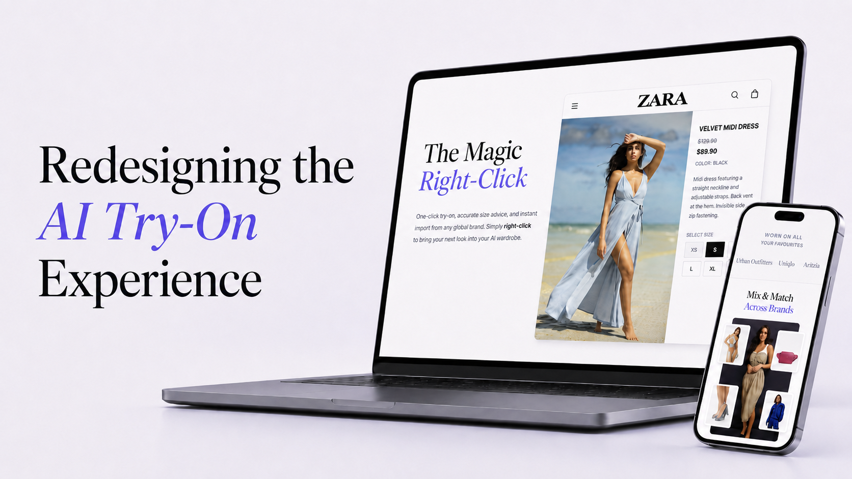
I redesigned the marketing website and onboarding experience to clarify the product value, demonstrate the extension workflow, and create a more direct path from discovery to installation.
ROLE
Product Designer
Founder, Visual Designer, and Engineer
TEAM MEMBER
User Research, Information Architecture, Website Design
SCOPE
TIMELINE
8 Weeks
STATUS
Launched in 2025
BUSINESS NEED
fAIshion.ai needed a clearer way to explain its AI virtual try-on extension and convert interested visitors into extension users.
CHALLENGE
How might we help first-time visitors quickly understand the product, see how it works, and confidently install the Chrome extension?
RESEARCH
When I joined fAIshion.ai, the website’s content and product flow were difficult to understand.
I interviewed 11 online fashion shoppers to understand how they evaluated virtual try-on products, what prevented them from trusting AI-generated results, and where they expected installation guidance.
Participants: 11 online fashion shoppers
Experience: Participants had no prior experience using Chrome extensions.
Method: 15-minute remote interviews and usability reviews
Focus: product comprehension, trust, installation, and try-on workflow
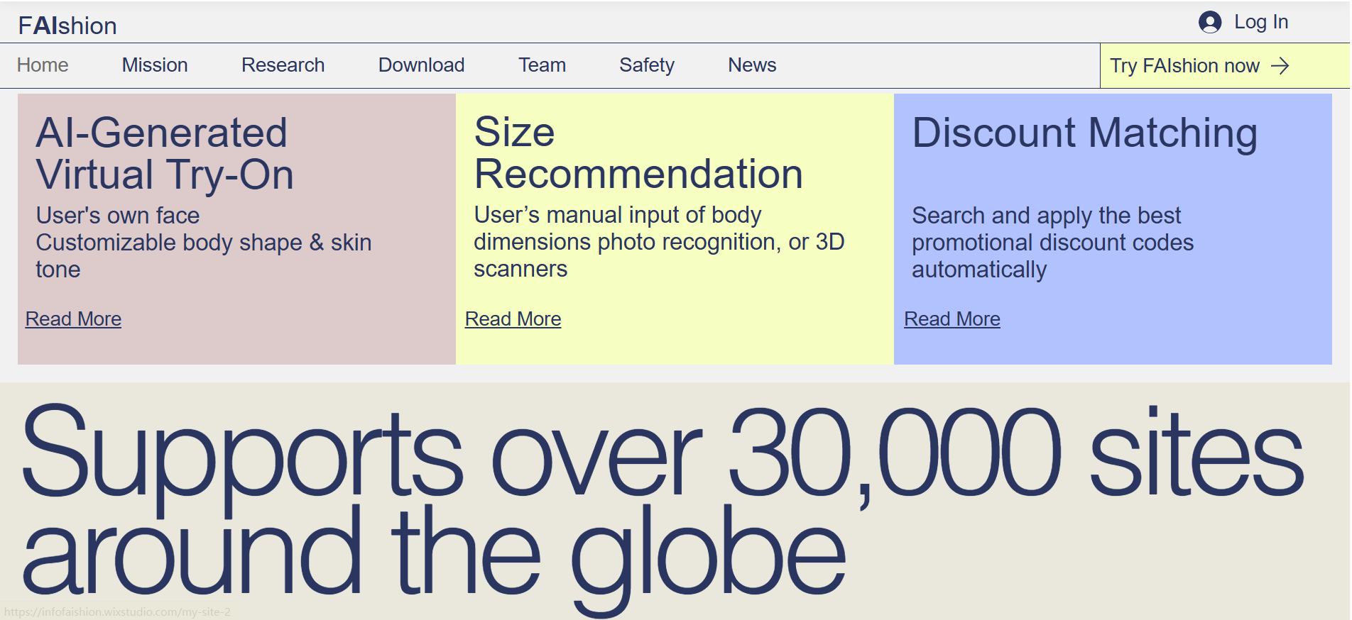
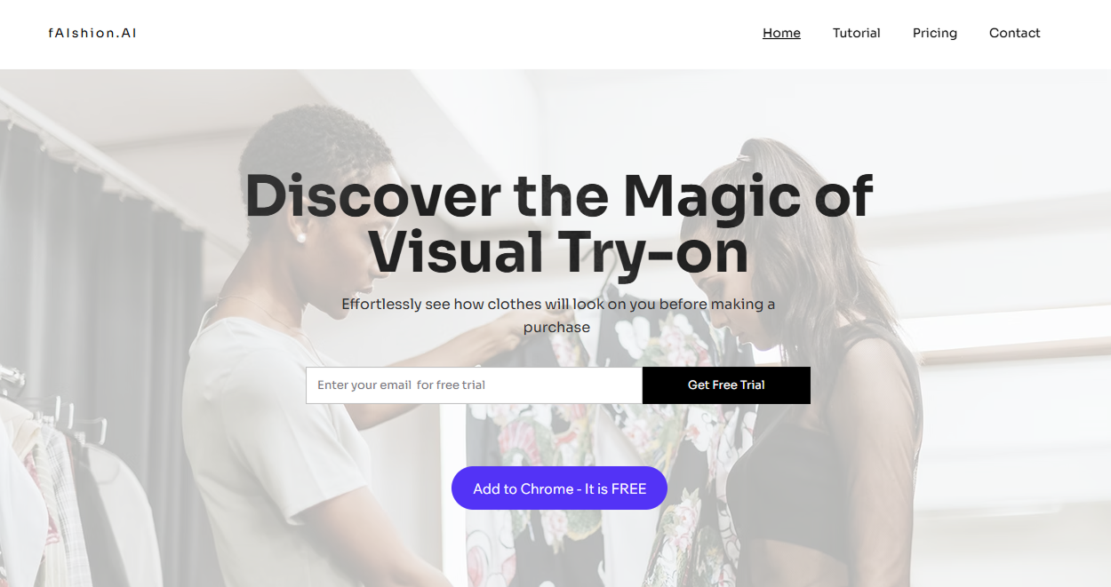
Original Website
UX Audit Findings
Competing Value Propositions
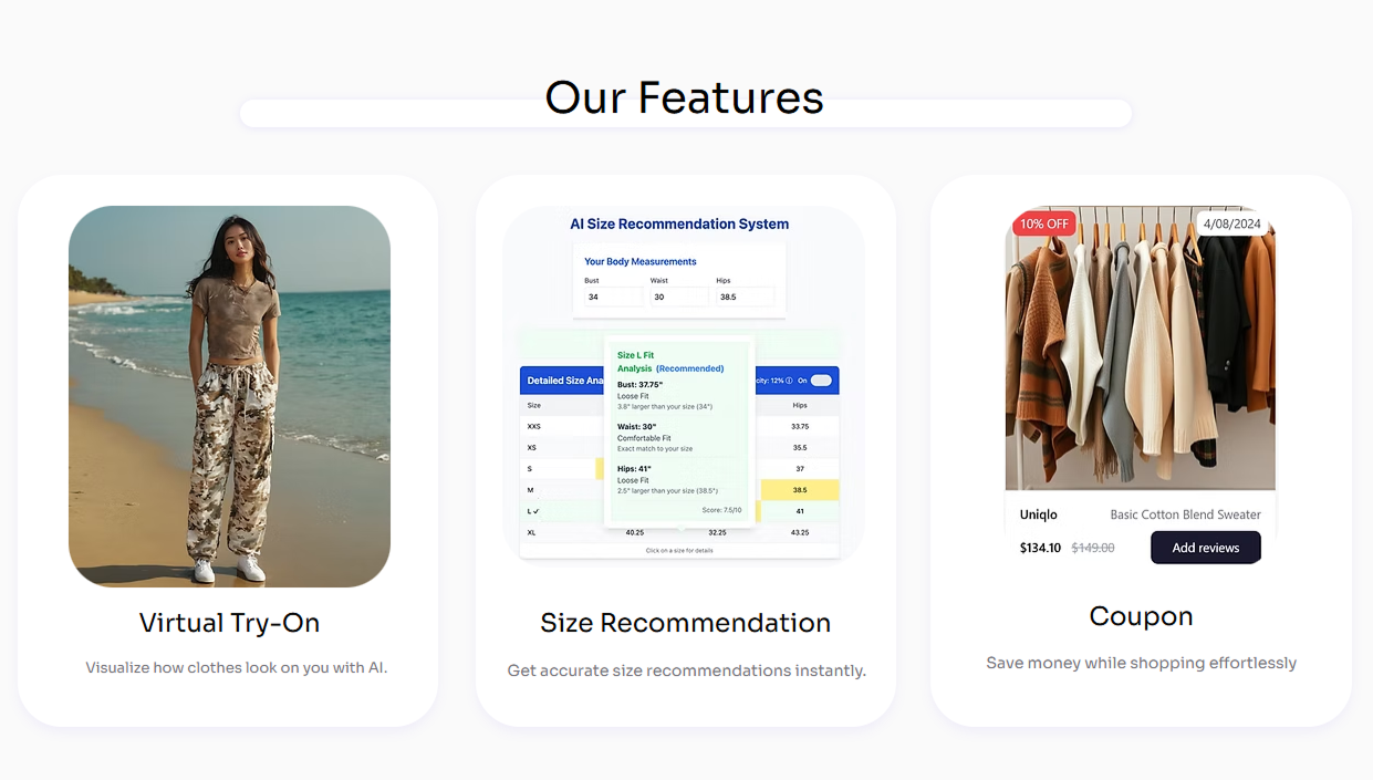
Three product capabilities received equal visual weight, making it difficult to identify the primary offering.
Missing Product Demonstration
The website described the technology without clearly showing the try-on interaction or expected result.
Limited Trust Building
The website made large compatibility claims without immediately showing examples, supported websites, or proof of the generated experience.
Research goals
What prevents users from quickly understanding what the AI try-on extension does?
How can we make the product value clearer and encourage more users to try it?
Where does the website fail to explain how to install and use the extension?
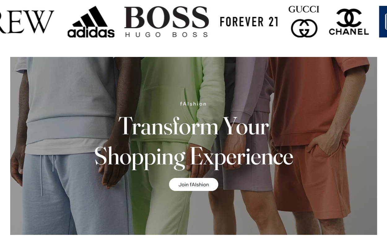
Competitive Analysis
To reposition the AI Virtual Try-On platform as a credible and innovative product, I conducted a competitive analysis of:
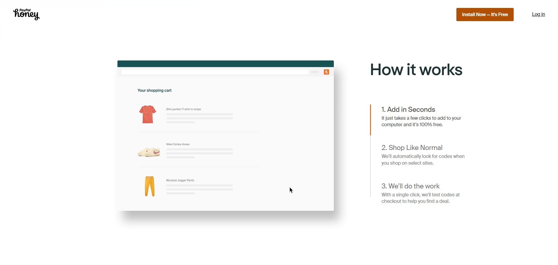
Interaction Reference: Honey
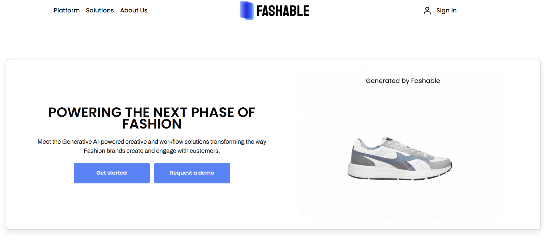
Adjacent Competitor: Fashable
Insights Summary
By studying websites for similar Chrome extensions and SaaS products, I identified two key opportunities:
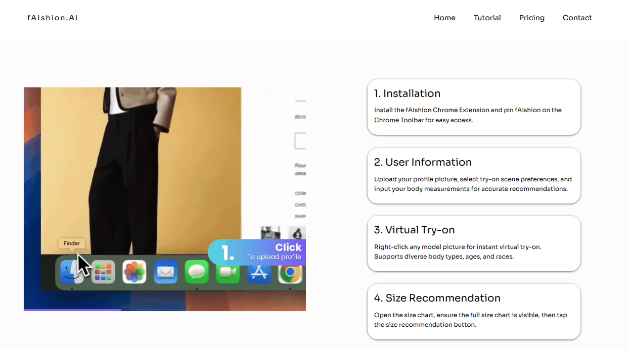
Demonstrate Before Asking Users to Install
Turn Installation Into a Guided Journey
Research Conclusion
Clearer messaging and guided onboarding can reduce confusion and increase adoption of the AI try-on extension.
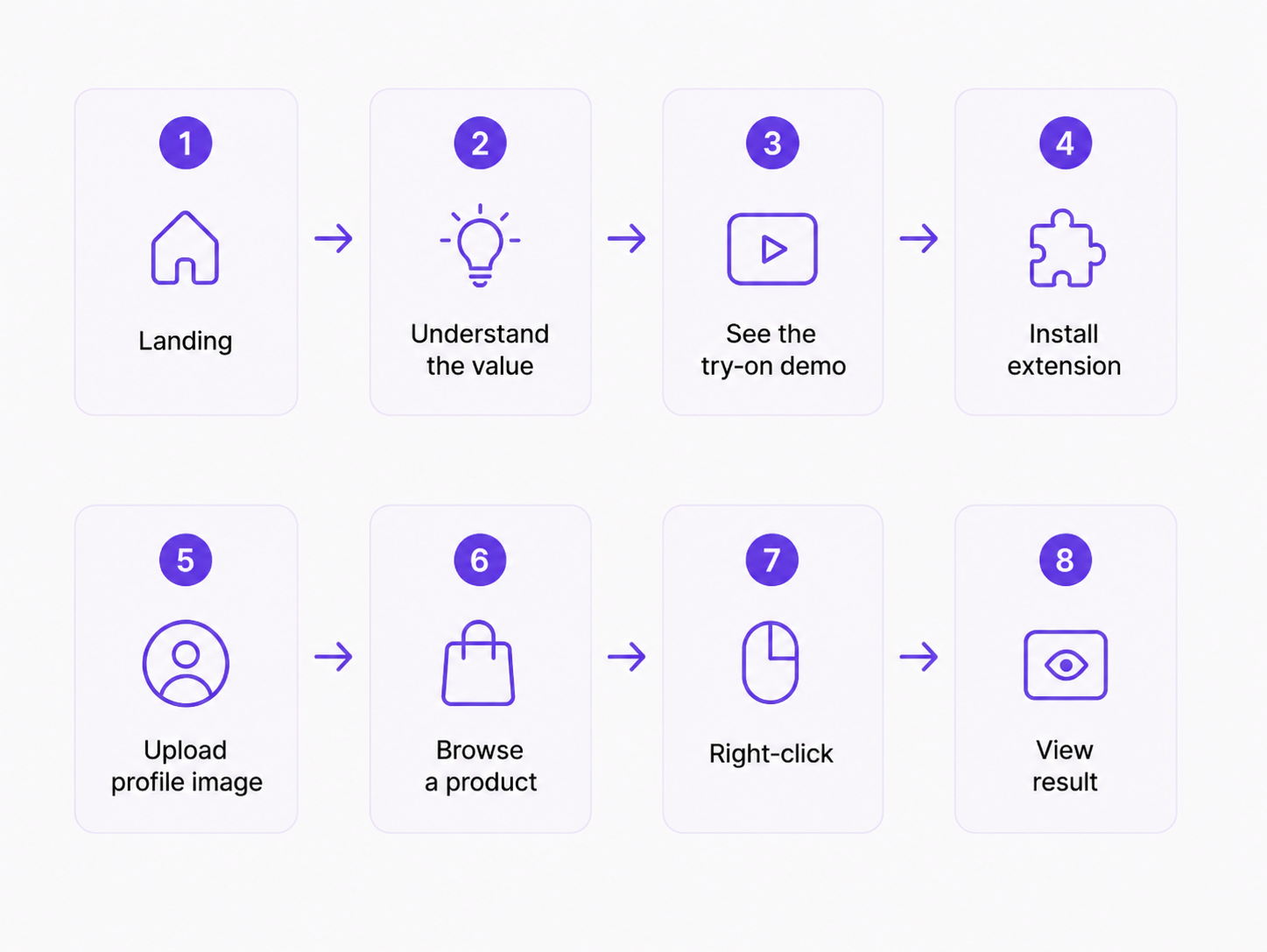
Mapping the Product Adoption Journey
To translate the research findings into actionable design priorities, I mapped the end-to-end journey from first discovering fAIshion.ai to completing the first virtual try-on.
DESIGN
High-Fidelity V1 (Clearer Structure, Weak Brand Alignment)
The first version improved information clarity, but its visual style did not fully align with fAIshion.ai’s brand identity.
ITERATION
Stakeholder Feedback & Iteration Direction
Stakeholders and internal team members felt that the revised structure made the product easier to understand. However, they also noted that the visual direction felt too muted and that the core Virtual Try-On experience did not receive enough emphasis.
Based on this feedback, I refined the design to better align with fAIshion.ai’s brand and strengthen the visibility of its primary product experience.
Introduced more vibrant accents to create a stronger and more recognizable visual identity
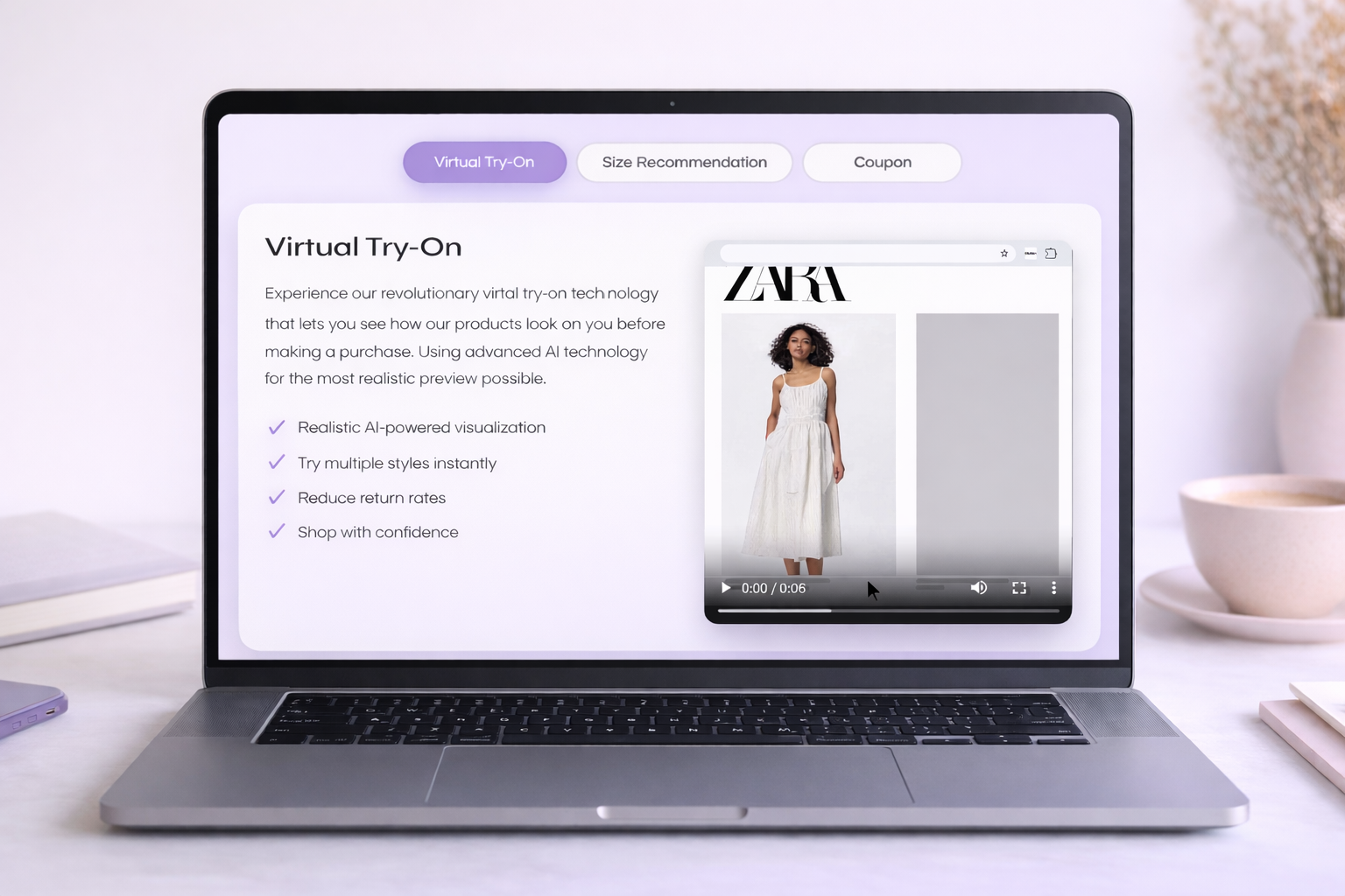
Increased the visual hierarchy and motion of the Virtual Try-On section to make the core feature easier to notice
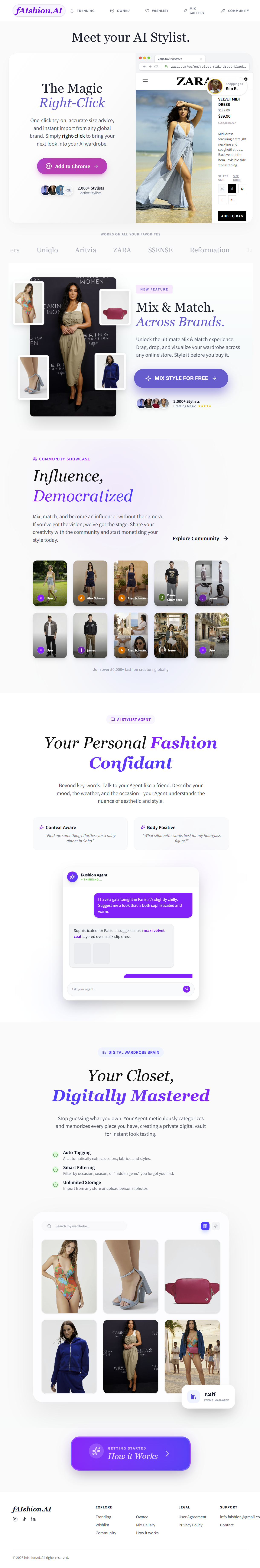
FINAL DESIGN
The product has continued to evolve since my 2025 redesign. The case study below focuses only on the website and onboarding work I completed during my eight-week engagement.
IMPACT
The redesigned platform helped strengthen the company’s credibility and online presence.
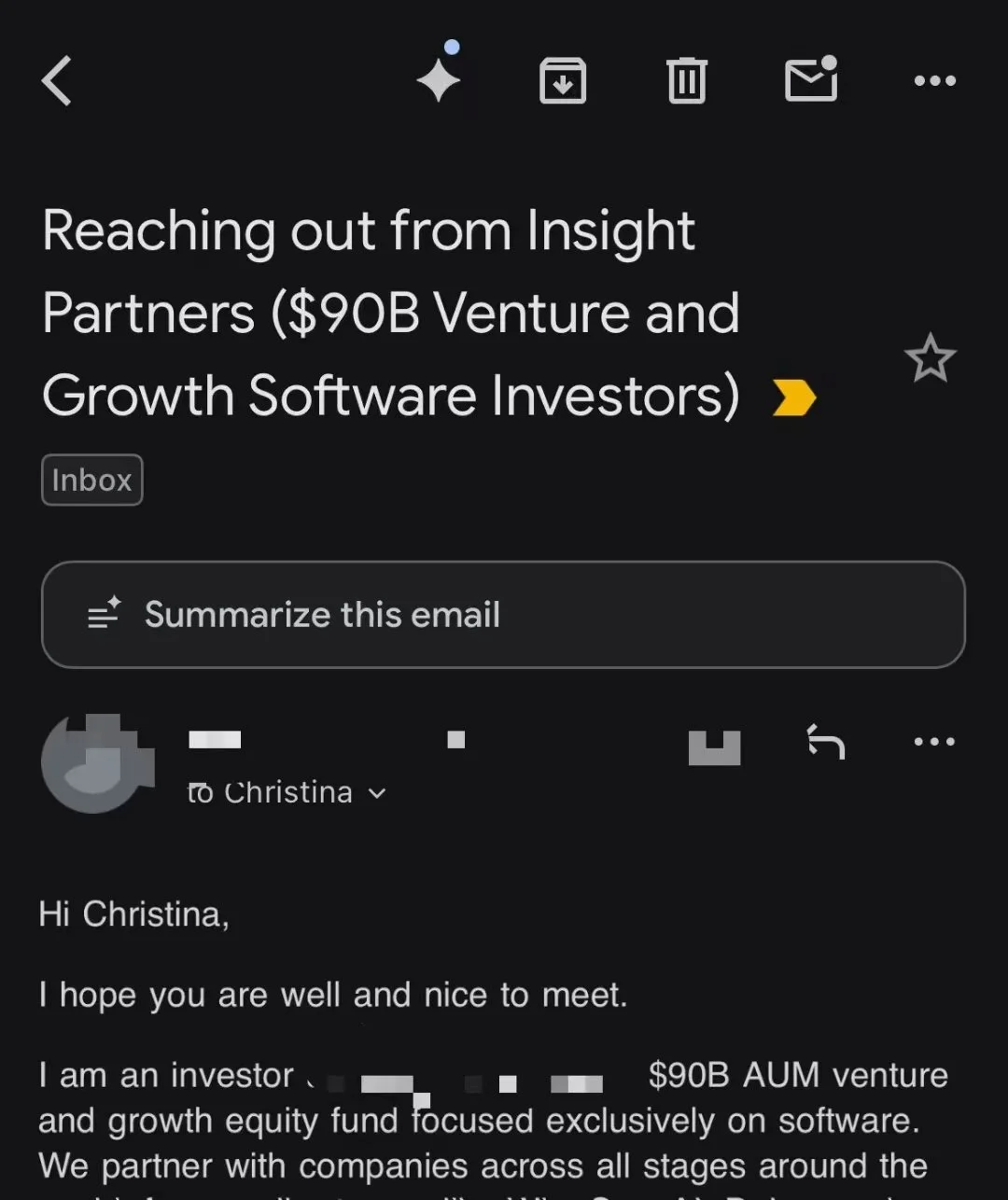
Investor Interest & Outreach
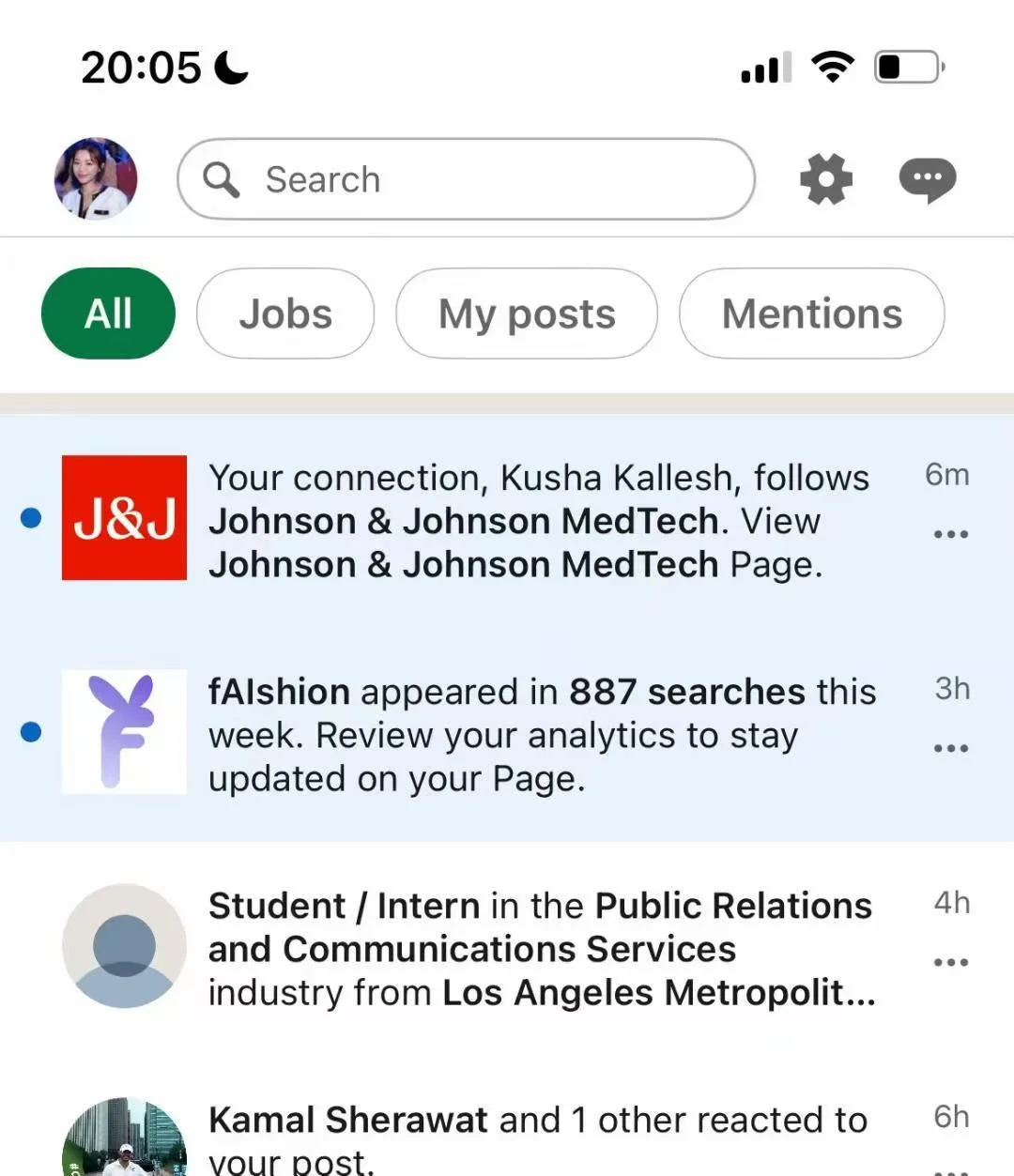
887 Weekly LinkedIn Searches
Takeaway
This project showed me that explaining an AI product requires more than describing its technology. Users needed to see the interaction, understand the expected result, and know what would happen after installation.
I also learned that clearer information architecture could improve comprehension, but brand expression and product demonstration were equally important for building trust in an unfamiliar AI experience.
2025
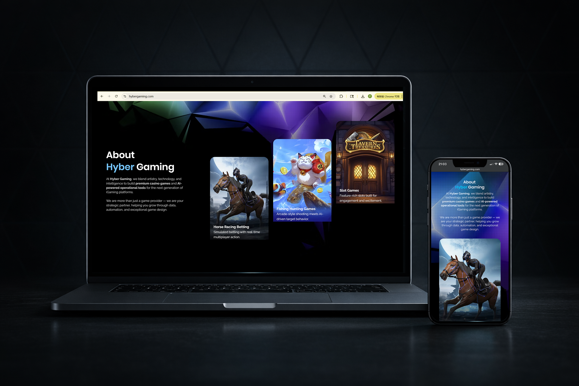
Turning a confusing brand into a game-first experience
Redesigning HyberGaming’s website to clarify its focus and support seven platform partnerships.