BACKGROUND
HyberGaming develops casino games and AI-powered operational tools for gaming platforms. However, its previous website mixed gaming, AI, and general development services together, making it difficult for prospective partners to understand the company’s core offering.
I worked with a product manager and an engineer to redefine the website’s positioning, restructure its information architecture, and create a clearer game-first experience.
ROLE
UI/UX Designer
Product Manager, Engineer
TEAM
Research, Information Architecture, Wireframes, Visual Design, Responsive Design, Usability Testing
SCOPE
TIMELINE
6 Weeks
Launched a website used in platform partnership conversations
OUTCOME
BUSINESS NEED
The website needed to communicate HyberGaming’s capabilities and support partnership conversations with game platforms and other business stakeholders.
GOAL
Help prospective partners quickly understand what HyberGaming builds, evaluate its game portfolio, and view the company as a credible studio.
CHALLENGE
How might we clearly position HyberGaming and showcase its game portfolio so prospective partners can quickly understand and trust the company?
RESEARCH
To understand why the website was difficult to interpret, I combined stakeholder interviews, informal usability feedback.
Stakeholder interviews: PM and team members involved in partnership conversations
User feedback: 17 visitors unfamiliar with HyberGaming
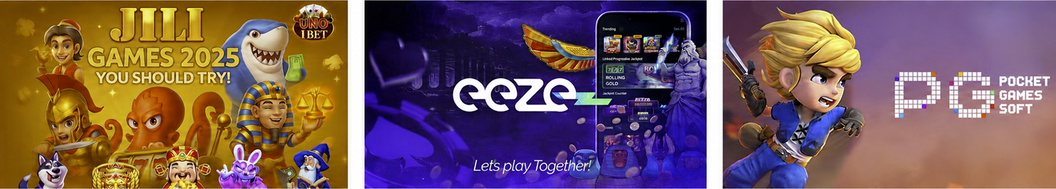
Competitive analysis: JILI Games, EEZE, and PG Soft

Existing experience audit
No visible game portfolio
Gaming, AI, and development services competed for attention
Dense service descriptions appeared before product evidence
Visitors could not identify the primary audience or offering
Research goals
I asked 17 participants who were unfamiliar with HyberGaming to review the website and explain what they believed the company offered.
User Feedback

Competitive Analysis
I analyzed leading game studio and publisher websites to understand how they communicate their positioning, showcase their portfolio, and establish credibility with potential partners.
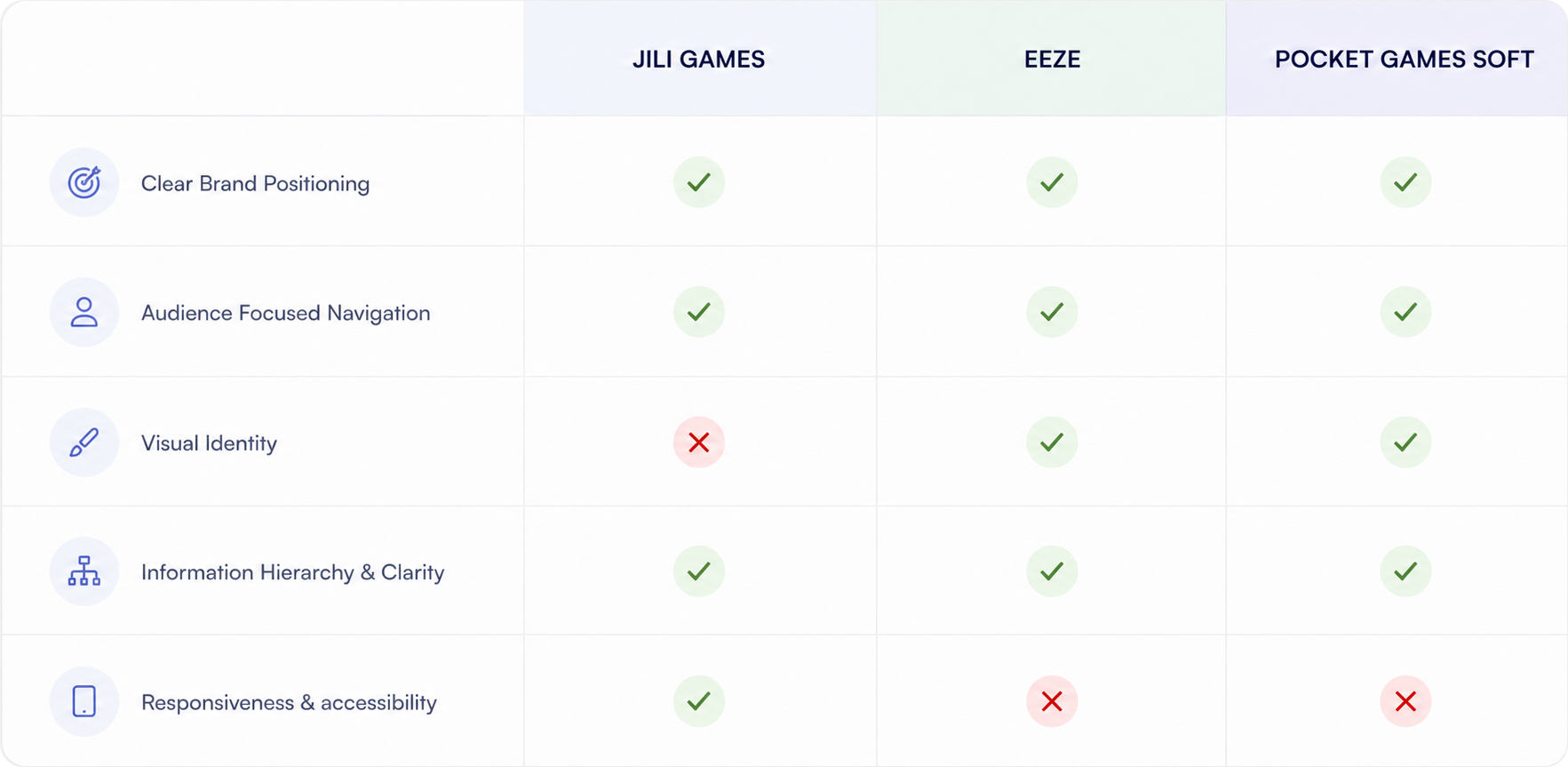
Key Takeaways
Clear positioning builds trust
Competitors clearly communicate their brand and products, helping visitors quickly understand what they offer.
Strong visual identity improves credibility
A consistent visual system and clear game showcase can make HyberGaming feel more professional and established.
Research Conclusion
The research showed that HyberGaming did not need more content—it needed clearer prioritization. Visitors should first understand the company as a game studio, see evidence of its work, and only then learn about its supporting AI capabilities.
STRATEGY
Based on the research findings, I defined key design principles to guide the redesign.
Design Principles
Key Product Decision - Lead With Games, Support With AI
HyberGaming did not need more content. It needed a clearer order of information.
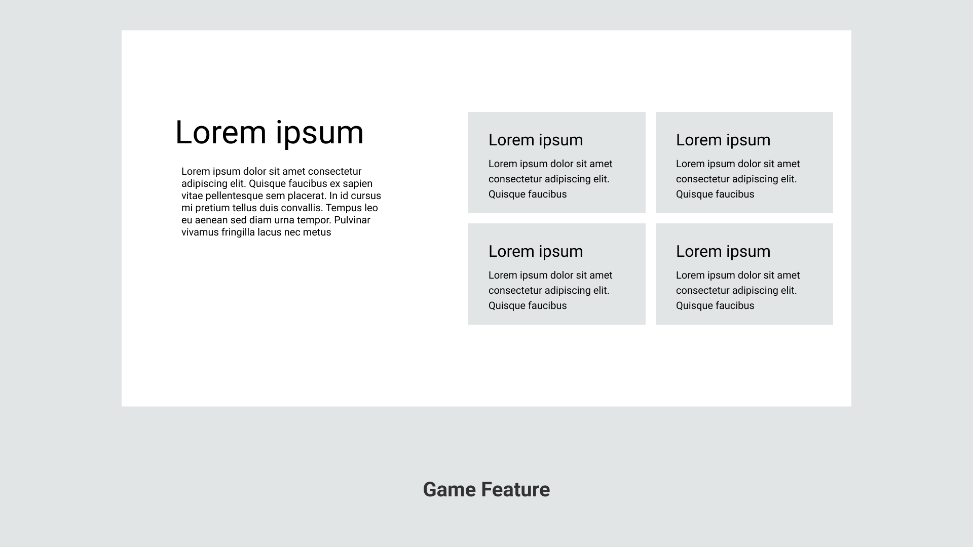
Showcase Games Clearly
Use structured content to help visitors quickly explore the game portfolio.
Focus on Essential Content
Highlight essential information and remove unnecessary messaging.
Build Trust Through Consistency
Create a cohesive visual system that makes the company feel credible and established.
Final Direction
We defined a game-first visual direction that makes HyberGaming feel modern, immersive, and professional.

DESIGN
Low-Fidelity
I explored multiple page structures to prioritize the game portfolio, simplify the company story, and help prospective partners understand HyberGaming with minimal scrolling.
High-Fidelity V1 - Too focused on a single game
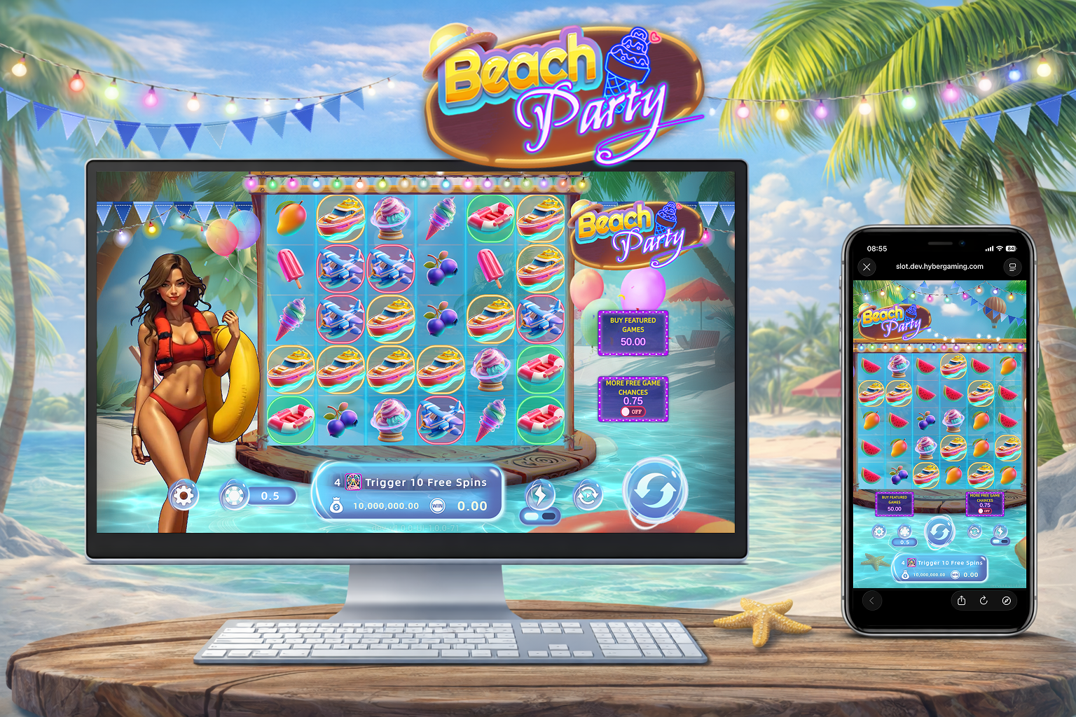
The first version borrowed too heavily from our only playable game, making the website feel like a game landing page rather than a company website.

What worked
Stronger visual identity
More engaging than the original site
Clearly communicated gaming
What didn’t work
The brand became associated with one game
Other products and capabilities felt secondary
The visual system would not scale as the portfolio grew
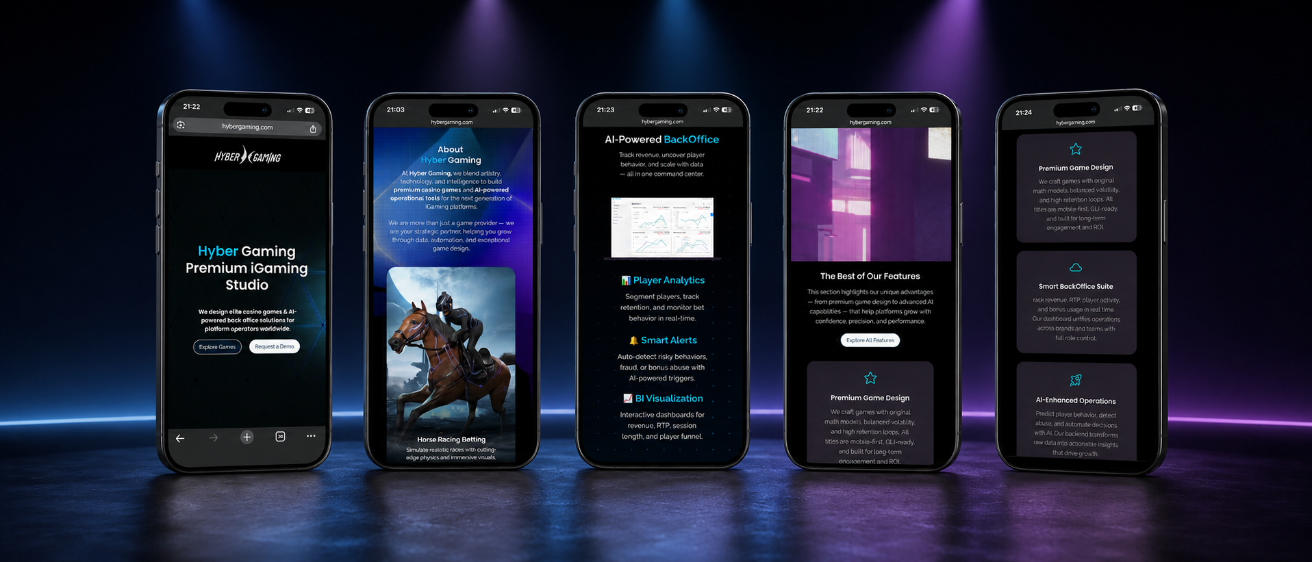
What changed
Removed the single-game visual dependency
Used a flexible studio-level visual system
Presented games as a portfolio rather than one hero product
Moved AI and back-office capabilities after demonstrating game expertise.
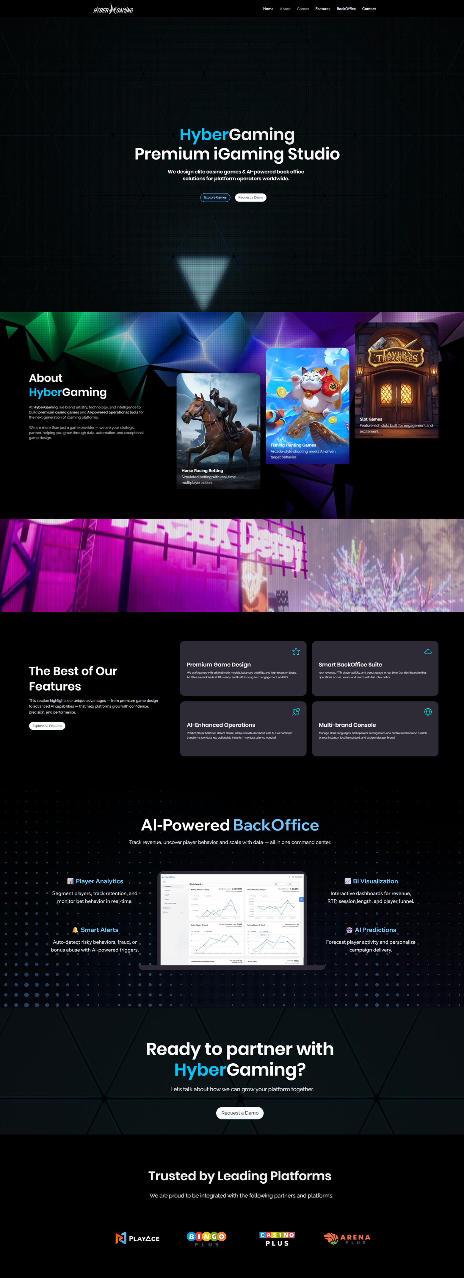
FINAL DESIGN
Before vs After

Games were difficult to find
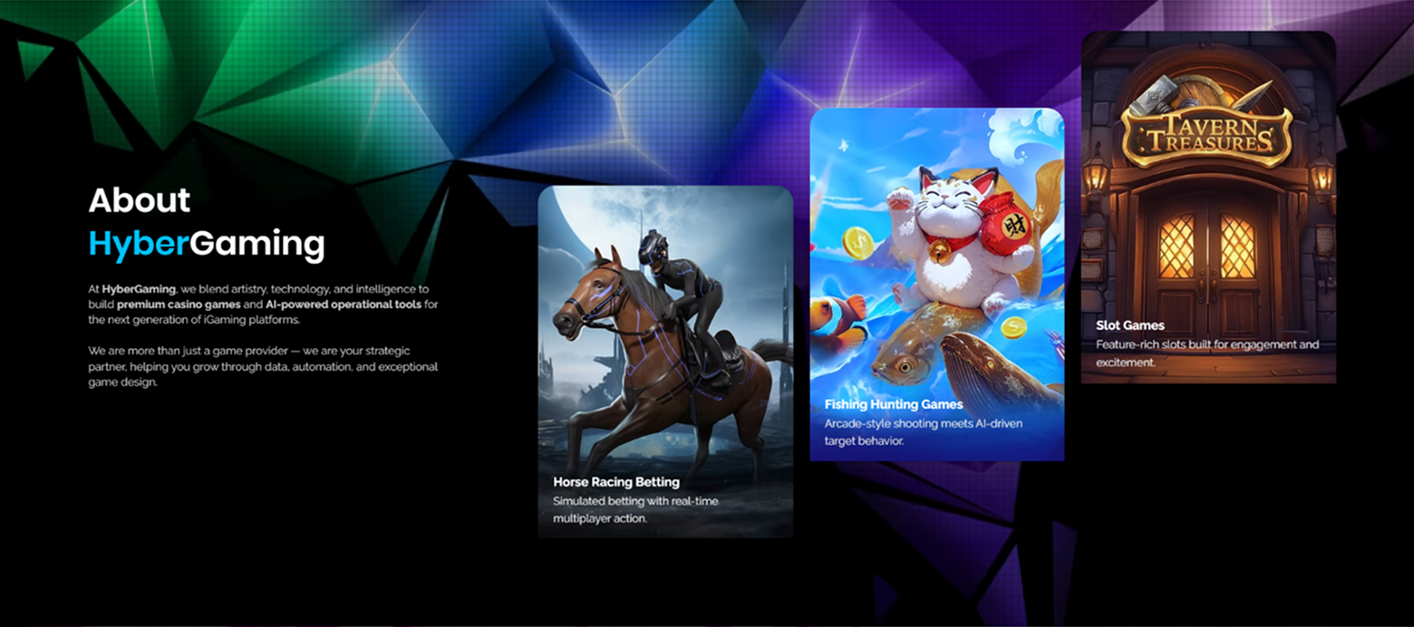
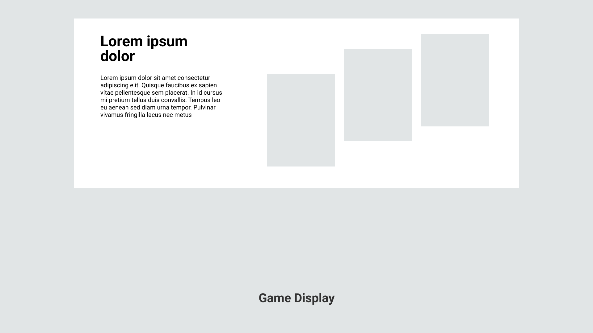
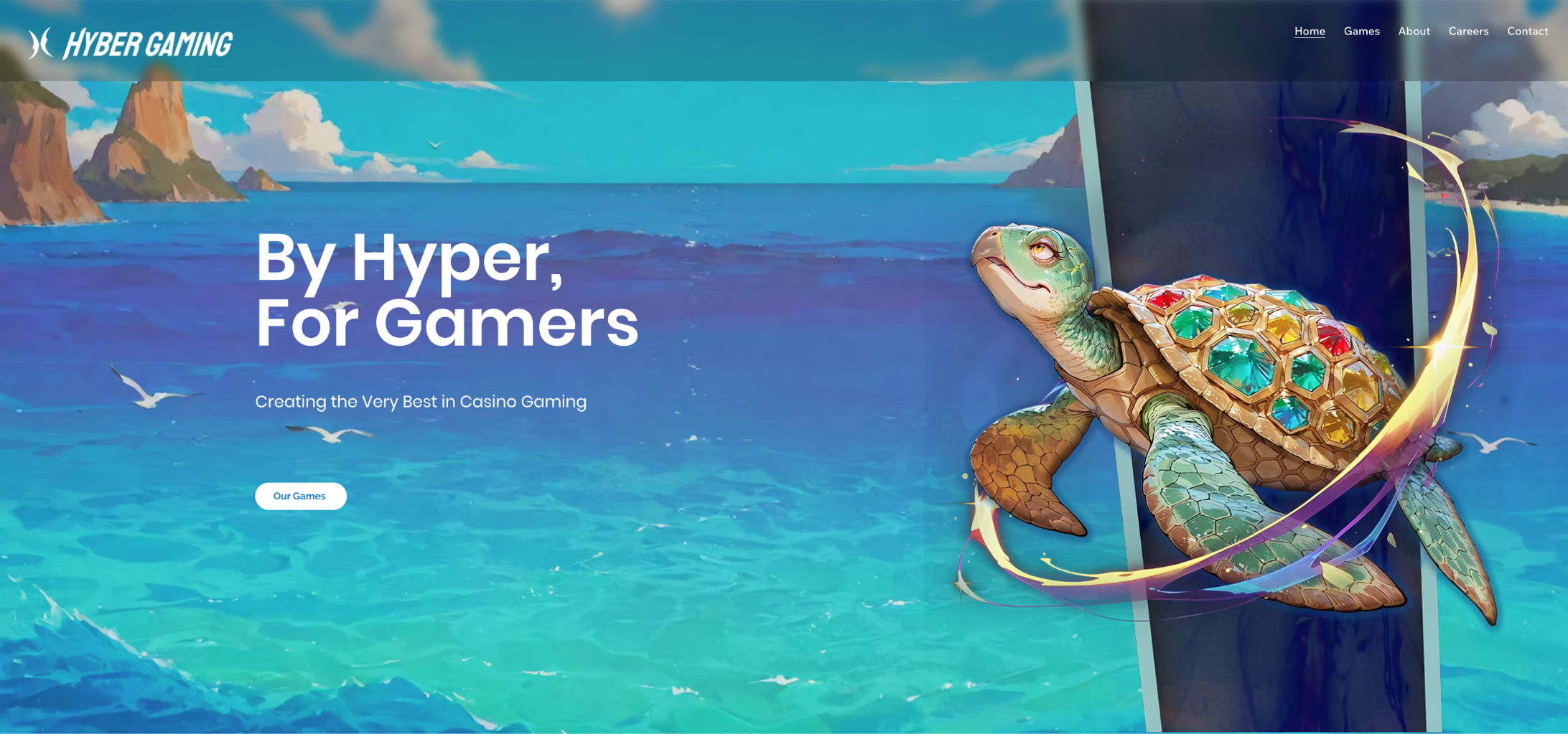
The game portfolio appears early as product proof.
AI, gaming, and services competed for attention
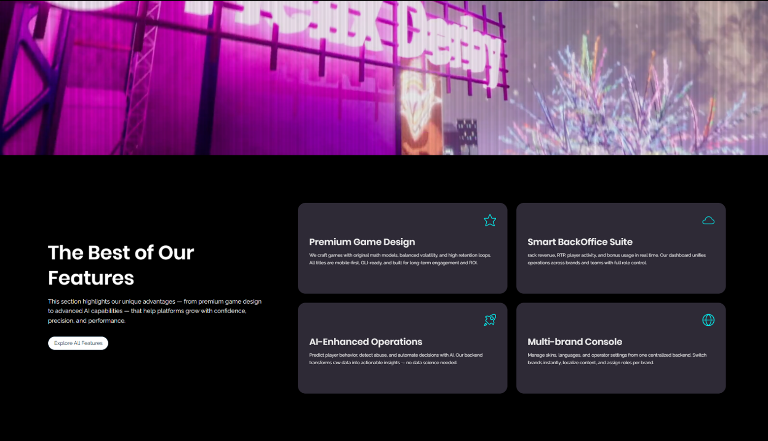
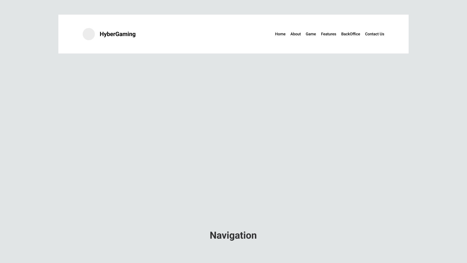
Game-first hierarchy with AI as support

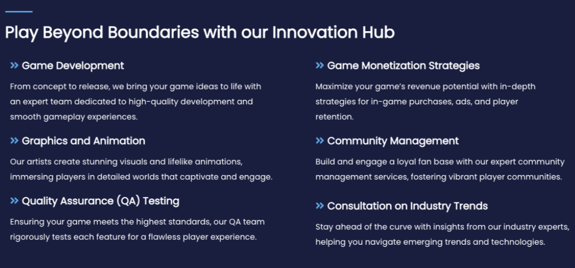
Tech stack was shown, but service explanations were missing.
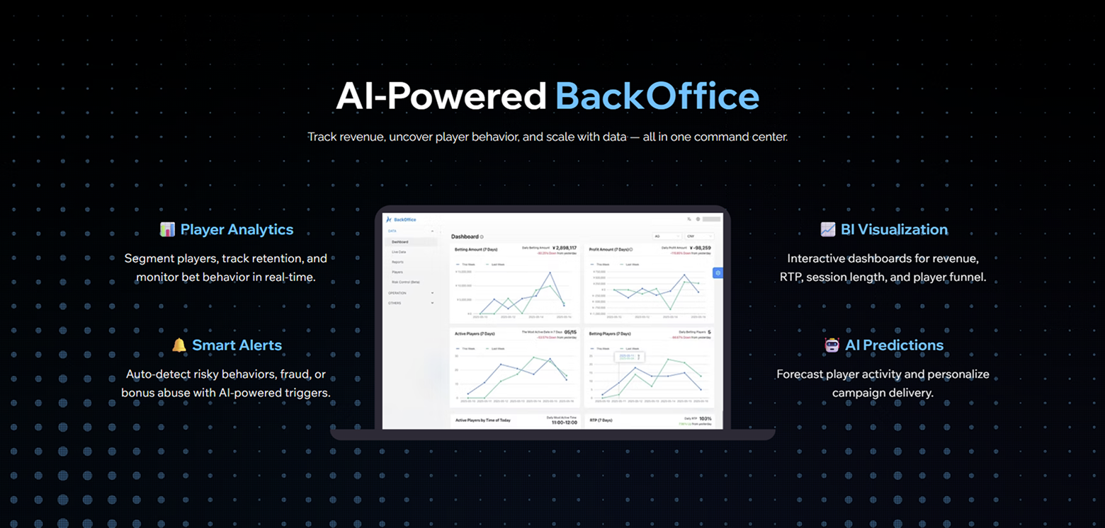
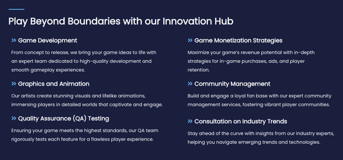
Scannable sections organized around services we provide
IMPACT
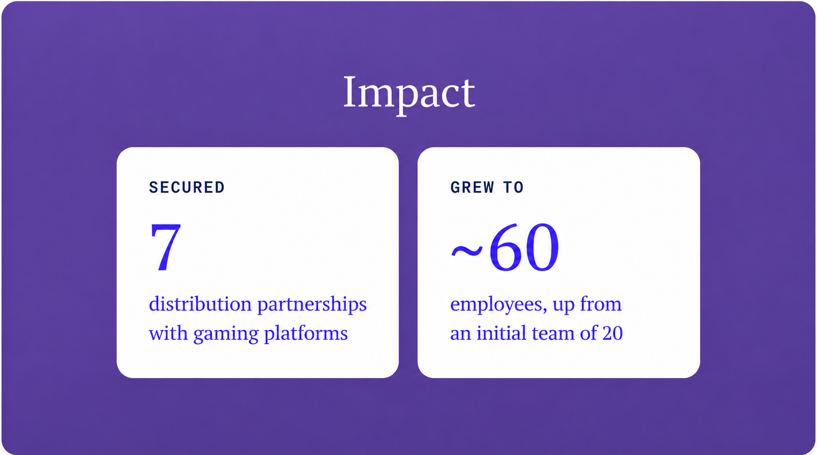
Supported 7 Platform Partnerships
The redesigned website became a supporting asset in HyberGaming’s partnership conversations, helping prospective partners understand the company’s game portfolio, operational capabilities, and market positioning.
The company later secured seven platform partnerships. While these partnerships were driven by broader product and business efforts, the website provided a clearer and more credible way to present the company during external discussions.
Additional Outcomes
Established a clear game-first brand direction
Created a scalable structure for adding future game titles
Improved consistency across desktop and mobile
Provided the internal team with a clearer company narrative for partner presentations
Takeaway
A visually compelling direction can still fail when it creates the wrong product perception.
Clear product positioning depends on content prioritization, rather than simply adding more information
Working closely with the PM and engineer helped me balance brand expression, technical feasibility, and partnership goals.
UP NEXT
Launching a new slot game style for younger players
Designed an end-to-end multi-platform slot game experience