fAIshion.ai Website Redesign
Overview
fAIshion Virtual Try-On Website Redesign.
Role
UI/UX Designer
Tool
Figma
Duration
4 Weeks
fAIshion.ai Website Redesign
UI/UX Designer @ fAIshion.ai
At fAIshion.ai, I redesigned the UI/UX of the core product experience to improve usability and better communicate the platform’s AI capabilities.
I identified gaps in information clarity and user flow, and restructured the experience through clearer information architecture and interaction design. I led the end-to-end design process, from research and wireframes to high-fidelity design and usability validation.
I redesigned and restructured the entire website experience. The new platform emphasizes clarity, credibility, and innovation, showcasing the AI try-on technology through a modern, minimal, and product-focused interface.
Project
📄 Overview
fAIshion.ai is an AI-powered platform focused on virtual try-on experiences, helping users better visualize products through advanced AI technology.
To improve clarity and engagement, I contributed to redesigning the company website by refining the information architecture and simplifying key user flows. I was involved in the UI/UX design process, including research, wireframing, interaction design, and usability testing.
👥 Stakeholders
To address gaps in clarity and engagement, I contributed to the redesign of the company website, focusing on improving information structure and simplifying user interactions. I supported the end-to-end design process, from research and wireframes to high-fidelity design and usability validation.
Problem
⚡ The Challenge
How might we redesign the fAIshion.ai website to clearly communicate its AI-powered virtual try-on capabilities while improving user understanding and trust?
The original website failed to effectively communicate the product’s value. Visually, it lacked consistency—color usage was unbalanced, typography hierarchy was unclear, and the overall layout felt outdated.
From a UX perspective, users struggled to quickly understand what the product did or how it differentiated from competitors. The content focused heavily on generic descriptions rather than demonstrating the core AI technology and real try-on experience.
As a result, visitors often dropped off early, and potential partners found it difficult to trust the platform’s technological credibility.
Design Process
📚 Research
To understand why users struggled to trust and engage with the fAIshion.ai platform, I conducted research on user behavior, bounce rates, and interaction data. This helped identify key issues in clarity, usability, and brand credibility.
I also collaborated with stakeholders and the marketing team to evaluate the website from both user-facing and business perspectives. We found that users had difficulty understanding the product’s core value and how the AI technology worked.
These insights revealed that unclear messaging, lack of visual hierarchy, and insufficient demonstration of the AI experience were the main barriers to user trust and conversion.
“It feels interesting, but I don’t fully understand how it works.”
— User feedback
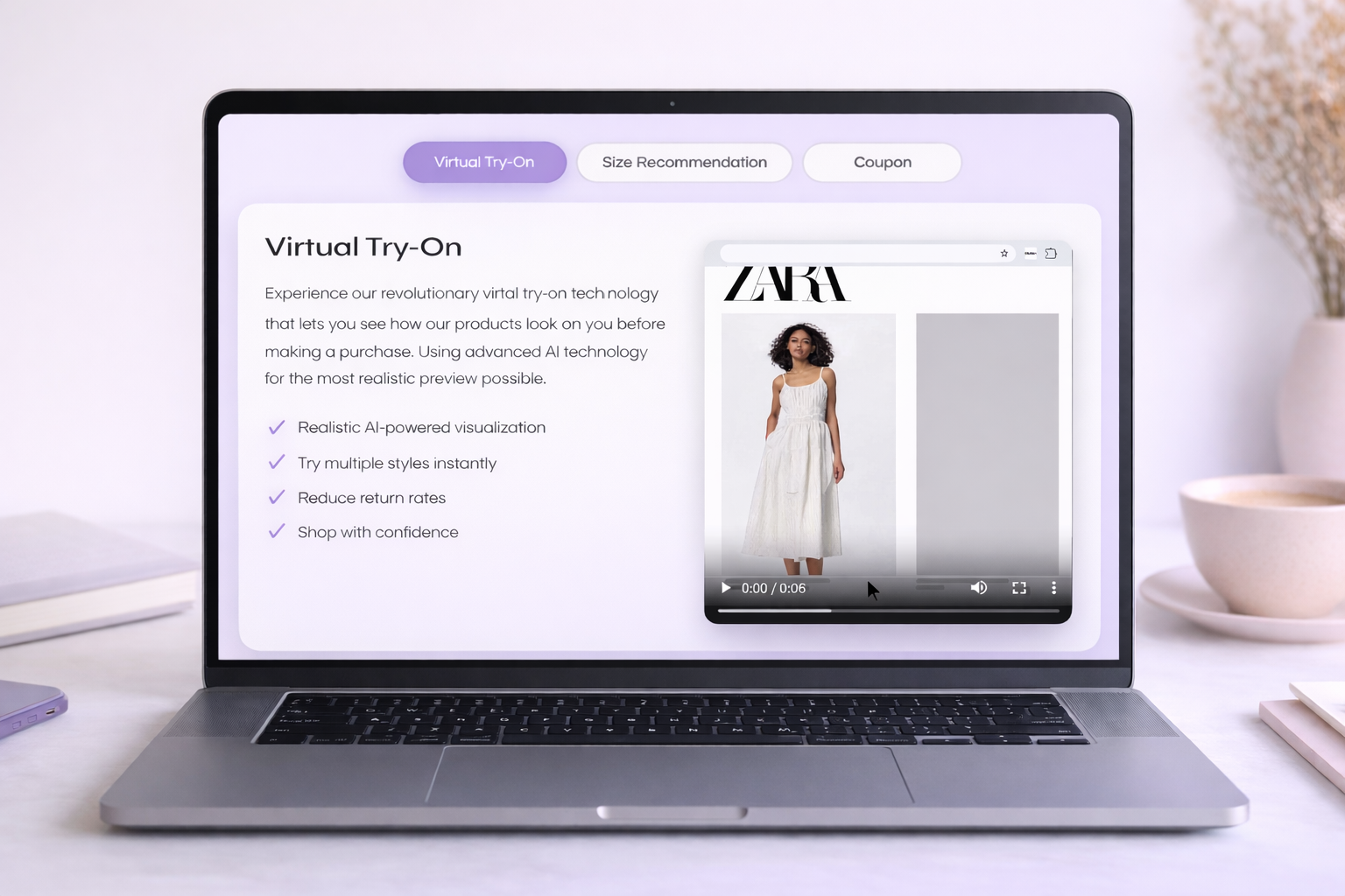
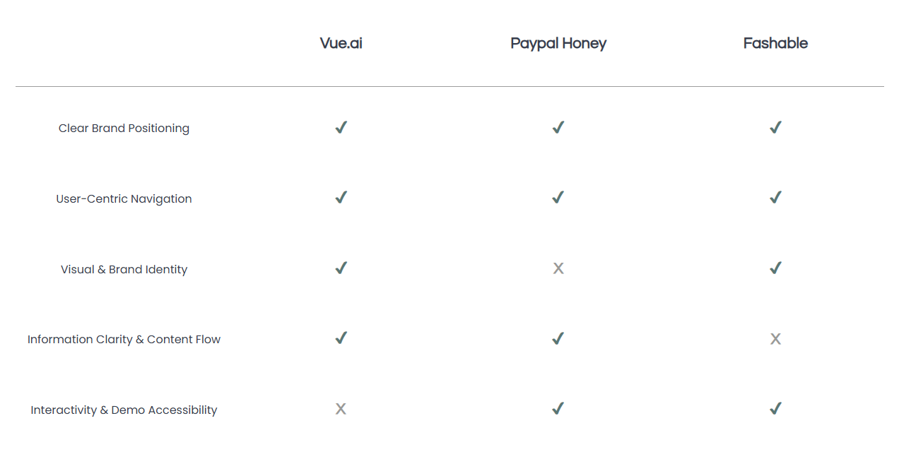
📊 Competitive Analysis
To reposition the AI Virtual Try-On platform as a credible and innovative product, I conducted a competitive analysis of:
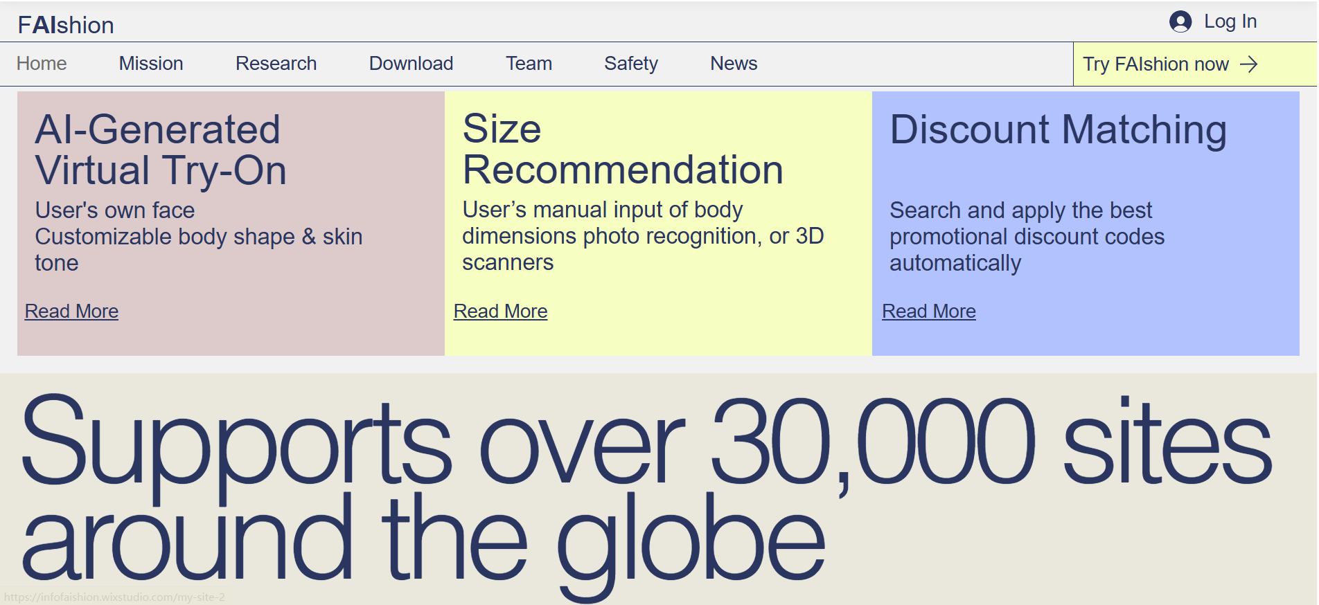
Original Website
📊 Research Insights
Research showed that AI platforms often struggle to clearly communicate their value, leading to confusion and low trust.
For fAIshion.ai, unclear messaging and weak visual hierarchy made it difficult for users to understand the product. This highlighted an opportunity to improve clarity, showcase the AI experience, and build user trust.
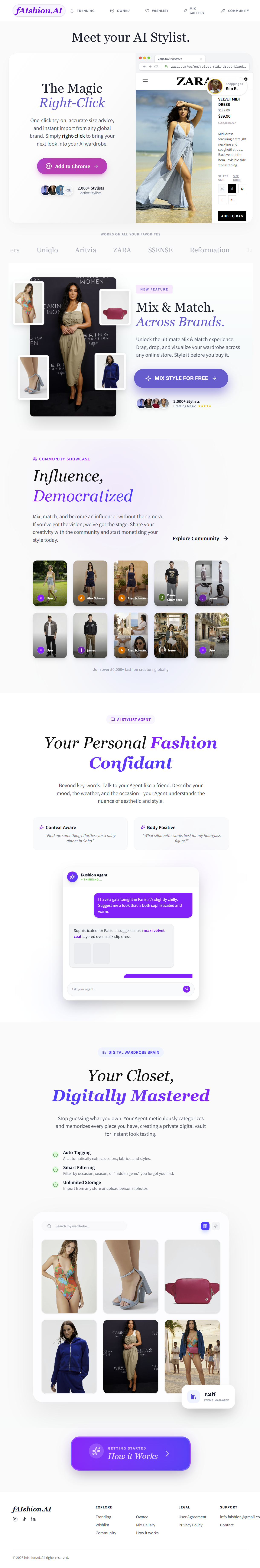
DESIGN
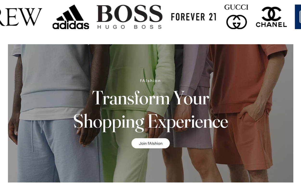
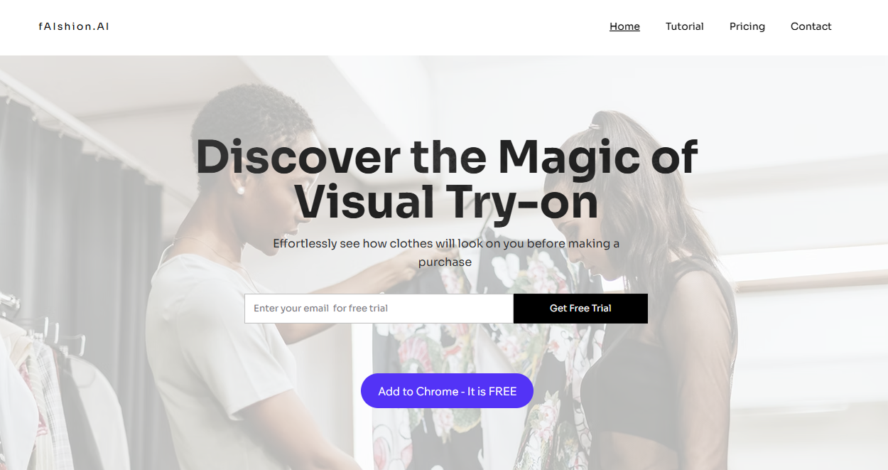
High-Fidelity V1
The design redefines Fashion AI as a reliable, forward-thinking AI try-on platform bridging technology and fashion.
It balances innovation with clarity, helping users and partners quickly understand the product and trust its technology
Feedback
🧪 Usability Testing
Users responded positively, but there was room for refinement.
Through usability reviews with stakeholders and early visitors, the redesigned website was appreciated for its clearer structure, improved consistency, and more refined visual tone.
However, several key issues emerged:
The visual style felt too muted and could benefit from more vibrant highlights.
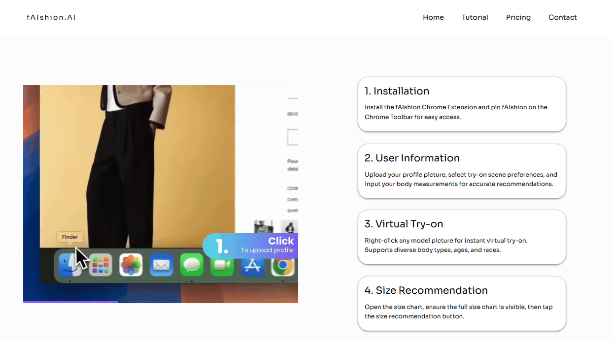
The Try-On section lacked prominence, causing users to overlook core functionality.
The information flow could be more intuitive, with a clearer path from explanation to demo.
Iteration
Based on the feedback, I refined the layout by enhancing contrast and motion cues to highlight the Try-On section as the website’s core experience.
I also introduced subtle color accents and interactive transitions to make the visuals feel more lively while keeping the overall tone professional and trustworthy.
Outcome
🚀 Upcoming Launch
The redesigned website repositioned Fashion AI as a credible and forward-thinking fashion-tech platform.
Post-launch, visits increased by 45% and session duration grew by 30%, indicating stronger engagement and clearer navigation. Click-through rates on the Try-On demo nearly doubled, showing improved recognition of the core feature.
The updated visual direction also strengthened brand trust, supporting future partnerships and investor presentations.
Takeaway
📈 Growth & Learnings
This project strengthened my ability to translate complex AI technology into clear, user-friendly experiences while balancing brand storytelling, usability, and technical clarity.
I improved my workflow through scalable, component-based design in Figma and enhanced my cross-functional communication—aligning user experience with product goals.
With more time, I would further develop a comprehensive design system and expand testing across diverse user groups to improve scalability and inclusivity.
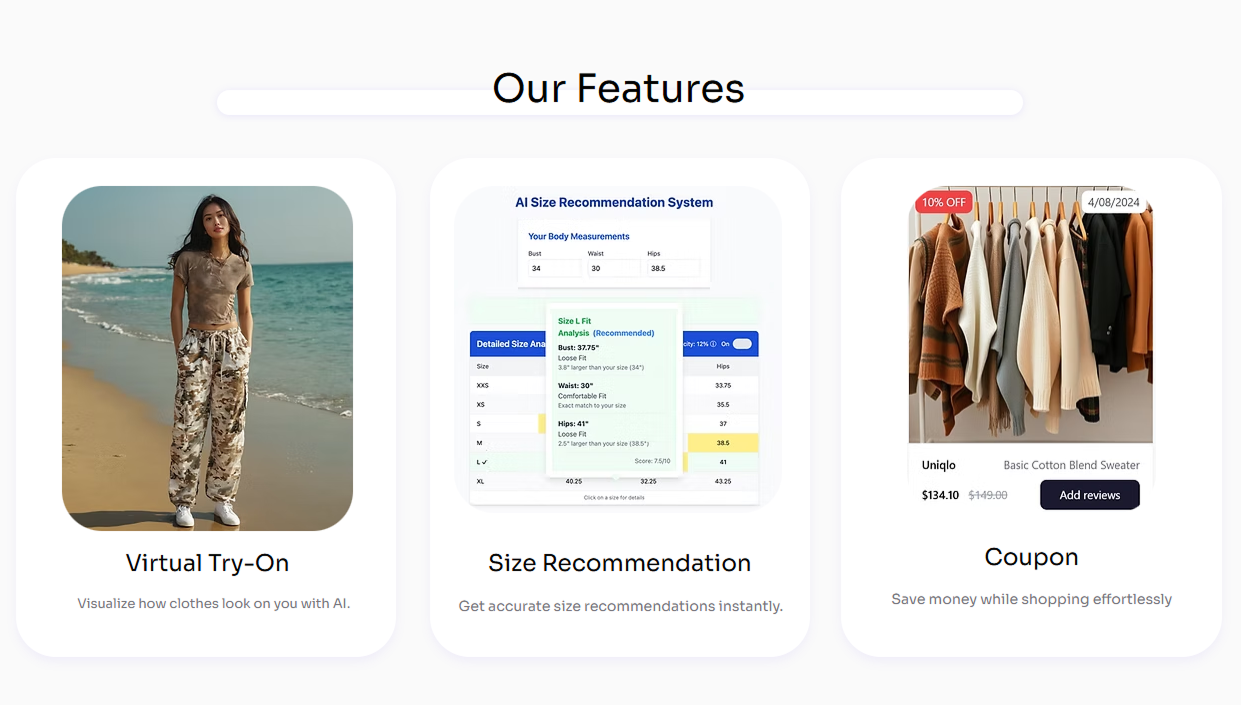
Final Design 🎮
The final design unifies brand identity and content structure into a cohesive experience, improving clarity, visual consistency, and overall usability while reinforcing HyberGaming’s game-focused positioning.